
We have a tendency to believe that anything we see in a chart is 100% accurate, although that’s often not true. To understand the accuracy of the chart, we have to understand a couple of things:
- How accurate the initial data was.
- How much of the original data set was used in the chart.
- How good the chart is at communicating the right message.
The third point is beautifully covered in the classic book How to Lie with Statistics and I’m not going to cover it here. I will say that many charts deliberately mislead and it’s worth knowing what tricks are used so that you can better interpret the data. If you haven’t read that book yet, I do recommend it. It’s very short and also entertaining.
What I am going to talk about here are the cases where the chart is trying to communicate accurately and yet there are problems with the data that make it misleading anyway.
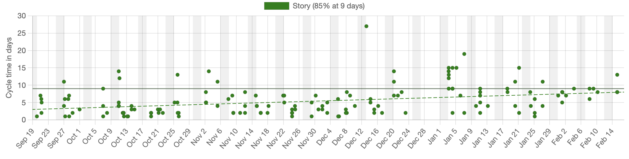
Let’s consider a cycletime scatterplot. The individual dots on this chart represent work items that have been completed. They’re graphed by the date they completed against the number of days that they had been in progress on the day they finished.
Let’s assume that this team considers an item started when it moves from Ready to In Progress and considers it done when it moves from In Progress to Done.
Completed issues without a start time
The chart shows many items that are completed but we’re not seeing everything. Specifically, we’re not seeing items that moved directly from Ready to Done without passing through In Progress. For those items, while we know when they finished, we have no idea when they started and are therefore unable to calculate cycletime.
“Surely, this would never happen”, you say. It happens all the time and the chart above just quietly doesn’t show those items. They don’t appear as dots and they don’t get included in the calculations of the 85% percentile. This missing data just quietly skews the results.
Backwards movement on the board
Moving items backwards on the board is generally a poor practice for a number of reasons. The one we care about here, is that it often, but not always, messes up the metrics.
Moving an item backwards runs the risk that we cross the start or end point in the workflow. For example, we might have an item that had previously been considered Done and we move it backwards into In Progress, changing the cycletime of that item.
The more common case is that an item that had been legitimated started, is moved backwards into the backlog so we can pretend that we’d never started it. Of course, we had started it and we’d spent time working on it so ignoring all of that time will skew the numbers. Should we give the item a new start time when it moves to In Progress again or should we consider it still in progress while it’s in the backlog? There is no clear answer here. The data is misleading in either case.
I’ve even seen a case where the board was so poorly configured that items would be created in a Done status, moved backwards to Ready and then forward again. Trying to visualize data from a system like this is a nightmare.
People not updating the ticketing system when they actually start/stop working on an item
The data ultimately assumes that people updated the system as things changed. If they don’t, the data will be wrong and there’s nothing we can do about that. There are times that we can look at secondary data sources to identify when this happened, such as Git commit logs or subtasks moving while the primary tickets don’t.
Being able to identify when we think the data is wrong is helpful, but that doesn’t make the data any less wrong.
Gaming the numbers
Then we get to the case where the numbers were actually “gamed” in order to give us credit for work done or to make us look better.
I’ve seen cases where people wanted to “stop the clock” because they were blocked on another team or because there was a production freeze.
Numbers get gamed all the time, usually with some positive intention such as making the team look better, but that skews the numbers and should be discouraged.
Removing outliers
We will often deliberately remove extreme outliers in order to make the chart more readable. For example, the chart above had its highest cycletime at about 25 days. If this chart had legitimately had one cycletime at 600 days then the chart would be largely unreadable as all but one of the data points would be pushed down to the bottom edge. So removing that one data point would make the rest of the chart easy to read at the risk of eliminating one piece of data that might be relevant.
This is a variation of “gaming the numbers” but done to make the chart more readable, rather than to make the data look better. It has the same resulting problems however, and should be used sparingly.
Conclusion
We all tend to believe what the chart shows us and the prettier the chart, the more believable it is. We owe it to ourselves to dig a bit deeper to see how accurate it really is.
Shameless plug: The JiraMetrics tool dumps out a data quality report, showing all kinds of inconsistencies and errors in your data. This is a tool that we built and give away for free.