
One of the charts built into JiraMetrics is WIP by Parent, as shown below. What this shows is the total work in progress (WIP) on each given day. The WIP is then grouped by colour according to the parent (Epic in this case) that the original ticket belonged to.
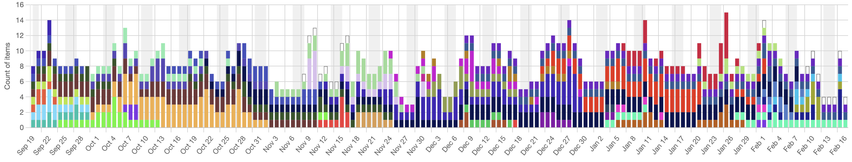
Assuming that we’ve sliced our epics effectively then this will give us a good idea of how focused we are. If everything we do on a given day is the same colour then that indicates that we’re highly focused on getting a single epic done before moving on to the next.
That’s not what the attached image shows, however. This shows a team that is working on many different epics every single day and whose focus is extremely scattered. Being so scattered, it’s highly unlikely that they are any good at delivering value to their clients.
Why might we do something like this?
- I’ve seen cases where a team has six clients on the go and wants to be able to honestly tell each client that their work is actively in progress.
- I’ve seen other cases where we’ve optimized for busyness (resource efficiency), ensuring that every person is busy all the time.
Both of these are attempting to solve perception problems, while making the more important factors of effectiveness, flow efficiency, and predictability, all worse. We want to look good, even if it means that we’re measurably worse.
The other alternative is that they’re just really bad at slicing their epics. Either way, this team has a problem to be solved.
You might think that a chart like this is unusual and that most teams are highly focused, yet that’s not been my experience. I find that while most teams think they’re highly focused, their data tells a very different story.
So what does your data say? Does it show that you’re highly focused on delivering value or does it show something else?