
I’ve worked in many places where an edict has come down from senior management to start collecting metrics, without any direction. While usually well intentioned, these requests are frequently poorly considered and poorly implemented. Many times I’ve asked “what decisions are going to be made from these” and nobody knows.
It’s common that we start taking measurements before we even know what problems we want to solve for. We want to be seen to be doing something and measurements are an easy place to start.
At one client, there was a small team that had been tasked with collecting metrics around the agile teams. So they’d come up with a survey with questions like “does your team have a product owner?” and sent them out to a bunch of teams.
When I first engaged with this team, they already had survey results from a subset of the organization. They were able to show me pretty charts but unable to explain what any of the charts really showed or what kinds of decisions we might make from those.
One in particular stood out. It was a line graph for “do you have a product owner” where the Y axis showed the number of teams that had a dedicated product owner, and the X axis showing the week that was true. The line started from very low on the first week and growing upwards week over week.
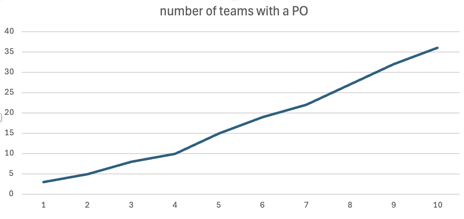
The only reasonable interpretation of this graph is that very few teams had a product owner when they started and that every week, more of those teams received one. Although very odd to have that many teams without a product owner, it showed that the situation was very quickly rectifying itself.
On the surface, it appeared that they had a real problem and that it was being fixed quickly.
But then I started to ask questions and realized that this isn’t what the graph said at all. The real story is that every single one of the agile teams already had a product owner and that every week, we had more teams answering the survey. The numbers went up because there were more data points in the collected data, not because problems were being fixed. This graph didn’t show problems; it showed participation.
You may think that this is an unrealistic example and that it would never happen at any reasonable company. This example was from a bank and I’ve seen similar patterns at multiple highly successful companies over the years.
Companies where when I ask “what are we measuring and what decisions do we hope to make?” I get nonsensical answers. Perhaps they asked what they should measure and weren’t given an answer. Perhaps they just never asked. In almost every case, when they’ve presented those pretty graphs back to their management, everyone acts impressed and then moves on to something else.
I’m a big fan of metrics, and data-informed decision making so this is infuriating to me. Yes, we should be measuring things, but we should be measuring the right things and then making informed decisions from those measurements. If we’re not prepared to make a decision then don’t collect the data.
That doesn’t mean that we have to have absolute precision before we start measuring anything. Perhaps we want a few general metrics up front so we can determine where we want to place our focus. I will often start with flow metrics if I’m not sure how to improve a system, but I’m fully prepared to stop collecting those if I determine that this isn’t where the problems are.
Back to the start, if you get a request to start collecting metrics, always ask what decisions we hope to make from those. Only then will you know what things to measure and with what granularity.
I’ve been focused on wasting our time by measuring things that don’t matter. It’s worth calling out, however, that people will change their behaviour based on how they’re measured. Measuring the wrong things can actually result in the entire system becoming much worse. See perverse incentives for examples of the wrong metrics backfiring.
Shameless plug: If you want to pull metrics out of Jira then JiraMetrics makes it easy.